Did you know? Nearly 97% of websites fail to meet accessibility standards, excluding millions of users and costing businesses access to $13 trillion in annual disposable income. Building accessible component libraries can change that – and it’s easier than you think.
Here’s how to get started:
- Follow WCAG 2.2 guidelines: Ensure components are perceivable, operable, understandable, and robust.
- Use semantic HTML: Native HTML elements work better with assistive technologies.
- Prioritize color contrast: Maintain a minimum contrast ratio of 4.5:1 for text and interactive elements.
- Test thoroughly: Combine automated tools (like axe-core) with manual testing using screen readers and keyboard navigation.
- Document accessibility standards: Clear guidelines ensure consistent implementation across teams.
Accessible design isn’t just ethical – it improves usability for everyone and boosts business performance, with companies reporting 28% higher revenue when accessibility is prioritized.
Start now: Build accessibility into your components from the beginning to create better digital experiences for all.
Using Automation to Test UI Components for Accessibility
Setting Up Core Accessibility Principles
Building an accessible component library starts with a commitment to inclusive design principles. These principles guide every choice you make, ensuring compliance, clear structure, and easy-to-use visuals.
Understanding WCAG 2.2 Compliance
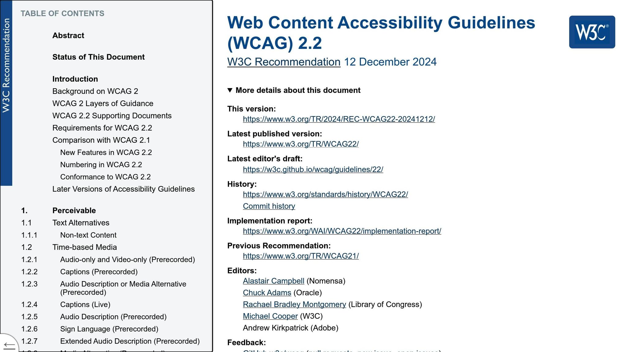
To create components that everyone can use, it’s critical to understand WCAG 2.2 guidelines. These standards are built on four key principles [1]:
- Perceivable: Information and UI elements must be presented in ways users can sense. For instance, use text alternatives for images, captions for videos, and ensure text has enough color contrast [1].
- Operable: All functionality must work through various input methods, especially keyboards. Every interactive element should be usable without a mouse [1].
- Understandable: Components should behave in clear and predictable ways. Users need to quickly grasp how your components function [1].
- Robust: Components should work seamlessly across browsers, assistive technologies, and user agents. Whether someone uses a screen reader or voice control software, your components should perform reliably [1].
WCAG 2.2 expands on WCAG 2.1, adding nine new success criteria to the existing 77, for a total of 86 criteria [5]. These updates focus on improving accessibility for users with low vision, cognitive and learning disabilities, and motor impairments. They also introduce enhanced support for touch-screen devices [5].
Most global regulations recommend Level AA conformance, which is a practical goal for your component library [5]. The Accessibility Guidelines Working Group also suggests adopting WCAG 2.2 to align with future policies and improve user accessibility [1].
Some WCAG 2.2 updates that directly affect components include:
- Ensuring interactive targets are at least 24×24 CSS pixels.
- Providing consistent help mechanisms across interfaces.
- Offering alternatives to cognitive tests for authentication [5][6].
Using Semantic HTML and ARIA Roles
Semantic HTML is the cornerstone of accessible components. It allows assistive technologies to interpret content effectively [3]. By using the right HTML elements for their intended purposes, you gain built-in accessibility features without extra work.
When it comes to ARIA (Accessible Rich Internet Applications), the rule is simple: use semantic HTML whenever possible. According to the W3C, "If you can use a native HTML element or attribute with the semantics and behavior you require already built in, instead of re-purposing an element and adding an ARIA role, state, or property to make it accessible, then do so" [2]. Misusing ARIA can lead to errors – studies show that pages with ARIA are 41% more likely to have detected issues than those without it [2].
ARIA is best suited for dynamic content and custom widgets that don’t have an HTML equivalent [3]. It consists of roles, states, and properties [8]. Use ARIA to define elements that aren’t natively available in HTML or lack full browser support [7]. When implementing ARIA:
- Assign
tabindex="0"for keyboard navigation. - Ensure all interactive components have accessible names.
- Align roles with user expectations [8].
Keep ARIA attributes updated as elements change, and apply them consistently across your library to provide a reliable experience [4].
Semantic HTML also has the added benefit of improving performance, especially for mobile applications. It reduces memory usage and enhances responsiveness [9]. For screen reader users, clearly defined sections and consistent structures make navigation smoother [9].
Creating Proper Color Contrast and Visibility
Color contrast plays a major role in ensuring users can easily read and interact with components. WCAG 2.2 specifies minimum contrast ratios: 4.5:1 for standard text and 3:1 for large text (18pt or larger, or 14pt and larger when bold) [1].
Contrast isn’t just about text. Interactive elements like buttons, form controls, and focus indicators also need sufficient contrast to remain visible. WCAG 2.2 emphasizes that focus indicators should always stay noticeable and unobstructed by surrounding content [5].
Avoid relying on color alone to communicate important information. Pair colors with additional visual cues like icons, patterns, or text labels. This ensures that users with color vision deficiencies can understand your interface just as well as those with typical vision.
Think about the visual hierarchy as a whole. Spacing, typography, and consistent patterns all contribute to an accessible design. Test your color choices with automated tools and manual evaluations to ensure they meet the necessary standards.
Building Accessible Component Patterns
- instead of relying solely on generic <div>` tags with ARIA attributes, you ensure that the structure and functionality of your content are communicated effectively.
A logical heading hierarchy is another critical aspect. Screen readers rely on clear <h1>–<h6> levels to navigate a page efficiently, so maintaining an organized structure is essential.
For images and visual elements, always include appropriate alt text to describe the content. If an image is purely decorative, use an empty alt attribute (alt="") to prevent unnecessary distractions for screen reader users.
Descriptive link text is equally important. Avoid vague phrases like "click here" and instead use text that clearly conveys the purpose or destination of the link. This small change can significantly improve usability and accessibility.
When semantic HTML doesn’t meet the needs of a particular component, you can enhance it with ARIA attributes. However, ARIA roles should only be applied when native HTML elements cannot achieve the desired functionality. Stick to these principles to build responsive, accessible, and touch-friendly components.
Finally, ensure your components are compatible with popular screen readers like NVDA, VoiceOver, and TalkBack. Testing across devices and assistive technologies is crucial to delivering an inclusive experience.
Touch-Friendly Design for Mobile Devices
Once you’ve built a solid foundation with semantic HTML and ARIA practices, the next step is designing for touch interactions. Unlike traditional mouse-and-keyboard setups, touch interfaces require special attention to physical realities. For example, the average fingertip measures 0.6–0.8 inches, while thumbs typically cover about 1 inch [11]. These dimensions should guide your design decisions.
Touch target size is one of the most critical factors. Interactive elements should be at least 48×48 pixels to ensure they’re easy to tap [10]. The WCAG 2.1 AAA guidelines suggest a minimum of 44×44 pixels, except when targets are embedded in text [12]. For users on the go, even larger targets – like the 2cm × 2cm buttons in Target’s mobile app for scanning and searching – can improve usability [11]. Additionally, maintain enough spacing between touch targets to prevent accidental taps. Use visual cues, such as color or size changes, to indicate when an element has been tapped. On devices that support it, haptic feedback can further confirm user actions.
Thumb-friendly placement is another way to elevate the experience. Position critical interactive elements within the natural reach of a thumb, typically in the lower half of the screen. This reduces strain and makes one-handed use more comfortable.
For gesture interactions, provide clear visual hints or onboarding guides for any custom gestures. While standard gestures like tapping and swiping are intuitive, nonstandard gestures should always include clear explanations and alternative methods for interaction.
Testing Accessibility with Automated and Manual Methods
After laying the groundwork with accessible design, thorough testing is the next step to ensure your components meet the needs of all users. Once you’ve created touch-friendly, semantically structured elements, it’s time to test them rigorously. This process requires a combination of automated tools and hands-on manual testing to cover all bases.
Automated tools are great for catching coding errors, but they only address about 60-70% of accessibility issues. The remaining challenges often require human judgment and real-world testing to fully uncover usability barriers.
"This does not mean you should avoid automated tools. Like any tool, it means they have a place in your toolbox. When used correctly they can be extremely helpful. When used in the hands of a novice they can result in a sense of complacency. When not used at all they can be a missed opportunity." – Adrian Roseli [18]
While automation excels at identifying technical violations, manual testing uncovers real-world usability challenges that impact actual users. Next, we’ll dive into the strengths of automated tools and how they fit into your testing strategy.
Automated Testing with axe-core Tools
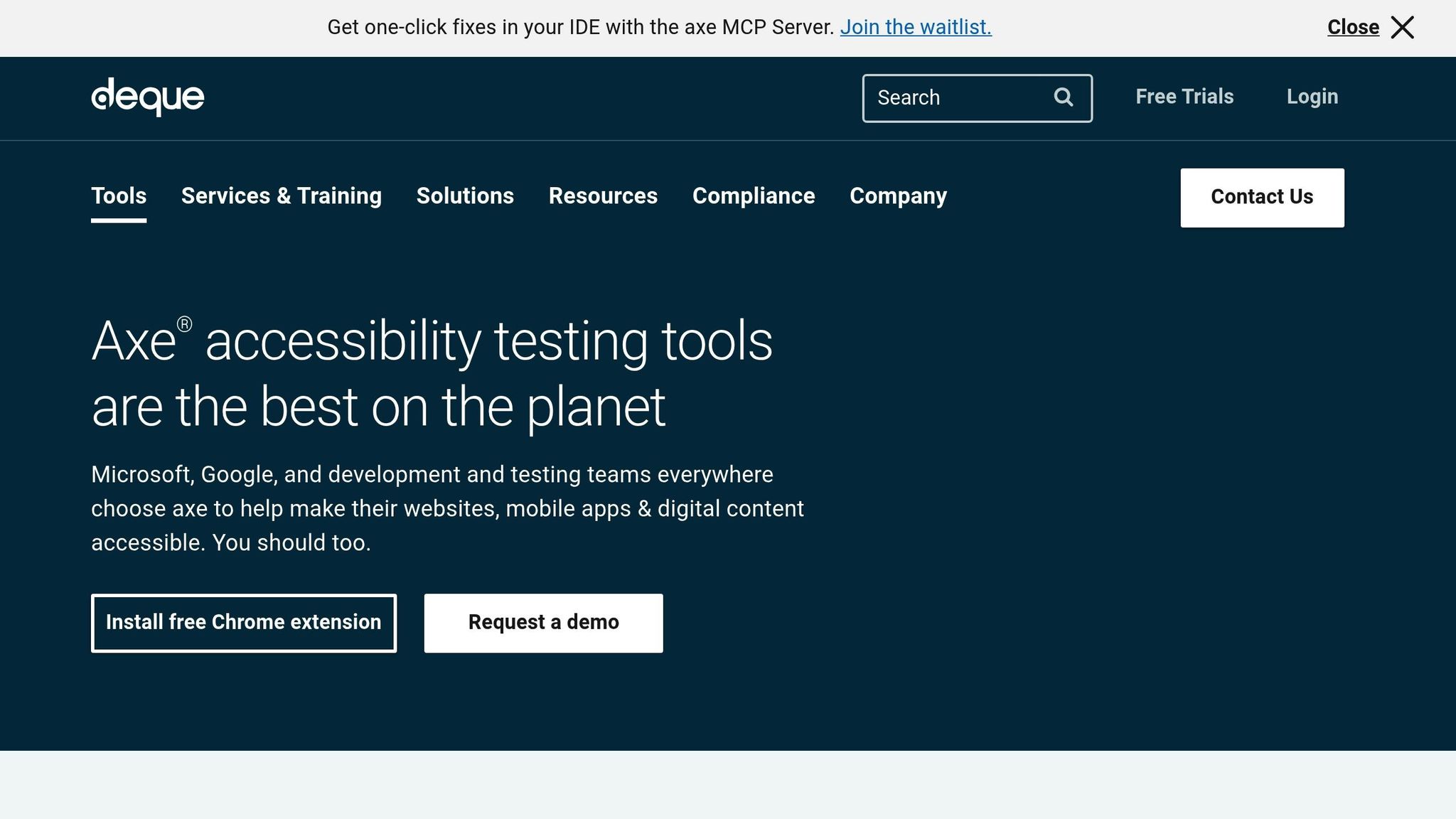
Axe-core is widely recognized as one of the most effective automated accessibility testing tools. It scans your code for common issues like missing alt text, poor color contrast, and improperly labeled form fields [13]. Tools like Axe DevTools can help you address up to 80% of accessibility issues during development [14].
By integrating axe-core into your CI/CD pipeline, you can catch accessibility problems early, before they make it into production [13].
Bob Andreasen, Executive Director of Software Quality Assurance at Harland Clarke, highlights the importance of automation in the workflow:
"Having tools that allow you to automate the scans and integrate them into your build process helps a lot because you don’t have to rely on somebody remembering to do it as part of your release process– it just happens automatically." – Bob Andreasen, Executive Director of Software Quality Assurance at Harland Clarke [14]
To get the most out of automated testing, align your tools with accessibility standards like WCAG 2.1 [13]. Also, configure tests to handle dynamic elements like pop-ups or modals, which can be tricky for automated tools to evaluate [13]. Finally, prioritize the test results to address the most critical issues first [13].
| Feature | Axe | Lighthouse | WAVE |
|---|---|---|---|
| Overview | Open-source tool by Deque | Open-source tool by Google | Web evaluation tool by WebAIM |
| Real-time Testing | Yes, in-browser results | Yes, via Chrome DevTools | Yes, instant browser evaluation |
| Automated Testing | Yes, supports CI/CD integration | Yes, via CLI and CI/CD | Limited automation |
| WCAG Compliance | WCAG 2.0, 2.1, Section 508 | WCAG 2.0, 2.1, best practices | WCAG 2.0, 2.1 |
Manual Testing with Assistive Technologies
Manual testing is essential for addressing the gaps left by automated tools. While automation identifies technical errors, manual testing ensures components are usable for people with disabilities [17]. This includes testing for screen reader compatibility and keyboard-only navigation [17].
Before starting, decide on the scope of your manual tests – such as how often to test, which pages or components to cover, and how to document issues [16].
Keyboard testing is a key part of manual checks. Every interactive element should have a visible focus indicator, and the navigation order must follow a logical sequence [16]. Test keyboard interactions by verifying that:
- Tab and Shift+Tab navigate logically.
- Enter activates primary actions.
- Spacebar triggers secondary actions.
- Arrow keys work for grouped elements like dropdowns or radio buttons [16].
For screen reader testing, free options like VoiceOver (Mac) and NVDA (Windows) are excellent starting points [16]. Test in the most commonly used browsers for each screen reader – Safari for VoiceOver and Chrome for NVDA [16]. Ensure that:
- All focusable elements are announced correctly.
- Dynamic updates are accessible.
- Form instructions and error messages are clear [16].
Document every issue you find, including the URL, a description, screenshots or recordings, and relevant HTML code. This helps identify whether a fix is needed at the template level or for individual components [16].
User Testing with People with Disabilities
Real user testing adds a critical layer to your accessibility strategy. While automated and manual methods catch technical and usability issues, only real users can provide insights into overall usability and experience [19].
With nearly 19% of U.S. adults living with disabilities – and more than half of them active online – testing with real users is essential [15]. These sessions can uncover challenges that even the most thorough manual testing might miss, such as the clarity of alternative text or the cognitive load of complex interactions.
When organizing user testing, aim for a diverse group of participants who use various assistive technologies and represent different disabilities. This ensures a broader understanding of how your components perform in real-world scenarios.
sbb-itb-d9ba0f3
Documenting Accessibility Features and Guidelines
Once testing is complete, it’s crucial to document accessibility standards clearly to ensure consistent implementation. This documentation serves as a bridge between testing and development, outlining guidelines that help developers execute designs correctly. Without it, even the best-designed components can end up being implemented incorrectly. Effective documentation not only guides developers but also makes the transition from design to development smoother.
Adding Accessibility Notes to Design Systems and Storybook
Accessibility annotations play a key role in making design decisions explicit. They help developers understand both what to build and how to build it with accessibility in mind.
Jan Maarten, Designer and Accessibility Specialist at GitHub, captures this sentiment well:
"Annotations are notes included in design projects that help make the unseen explicit by conveying design intent that isn’t shown visually. They improve the usability of digital experiences by providing a holistic picture for developers of how an experience should function. Integrating annotations into our design process helps our teams work better together by closing communication gaps and preventing quality issues, accessibility audit issues, and expensive re-work." [22]
In 2024, GitHub introduced an internal Figma library called the GitHub Annotation Toolkit to make this process more efficient [22].
Key areas to cover in your annotations include:
- ARIA roles and labels: Specify attributes directly on components.
- Keyboard interaction patterns: Outline how elements like modals or dropdowns should function.
- Focus management: Provide instructions for handling dynamic content.
Pinterest’s design system, Gestalt, is a great example of this in action. They created an accessibility design checklist in Figma to help designers follow WCAG 2.2 guidelines [23]. They also added annotation assets to their design handoff library to guide engineers in using semantic HTML, alternative text, and structured design [23].
Writing Accessible Code Examples
Accessible code examples are essential for translating design intent into functional, inclusive components. These examples demonstrate not only how components work but also how they can be implemented accessibly in practical scenarios.
Your code examples should include:
- ARIA attributes: Show how to make components understandable to assistive technologies.
- Keyboard handlers: Demonstrate proper navigation and interaction.
- Focus management: Ensure dynamic content is accessible.
- Error states and edge cases: Cover scenarios that might challenge usability.
Interactive sandboxes with built-in accessibility checks can also be valuable. They provide immediate feedback by flagging issues like missing alt text or poor color contrast. Additionally, examples should highlight progressive enhancement – illustrating how components function with JavaScript disabled, degrade gracefully in older browsers, and adapt to assistive technologies.
For instance, a button component example might show how it works in different contexts: submitting forms, triggering modals, or performing actions that require caution. Each scenario brings its own accessibility considerations.
Managing Version-Controlled Design Tokens
Design tokens are vital for maintaining consistent accessibility standards as your component library evolves. Proper version control ensures that updates don’t lead to regressions and that accessibility remains a priority.
To maintain consistency:
- Structure tokens hierarchically, using core tokens for basic values and semantic tokens for specific purposes. For example, instead of a generic green color, use a token like
color.icon.successto indicate its role and accessibility compliance [25]. - Document every token change with its version, date, rationale, and impact [20].
On April 17, 2025, the Axiom design system introduced Changesets, a tool for managing version control in multi-package repositories. Changesets track updates, automate version bumps, generate changelogs, and streamline releases. This approach ensures everyone understands the impact of changes before they’re approved, improving release quality [20].
Tools like the Design Token Generator can further enhance this process. It automatically checks for accessibility compliance, such as text contrast against WCAG 2.1 AA standards, and alerts users to issues as changes are made [24].
Mutasim Billah Toha, Software Engineer, highlights the importance of version control:
"Behind every version number is a set of human needs: developers who need stability, designers who need creative flexibility, product managers who need predictable timelines, and users who need consistent experiences." [21]
Team Collaboration for Accessibility
Creating accessible component libraries isn’t just about technical know-how – it’s about teamwork. Designers, developers, and stakeholders all need to come together to make accessibility a core part of the process, not an afterthought. When everyone works together, the result is a more inclusive product that aligns with the accessibility principles and testing strategies we’ve already discussed.
"Effective collaboration between designers and developers is crucial for creating accessible websites and applications from the start. Accessibility is a shared responsibility, with both parties working together to ensure that the end product is usable by all, including those with disabilities." – Aparna Pasi, Vice President of Services at Deque [26]
This shared commitment also opens the door for ongoing team training and smoother design-to-development workflows.
Accessibility Training and Resources
Educating your team on accessibility basics is a game-changer. When everyone understands why accessibility matters, they’re more likely to make inclusive choices during the design and development process. Take Honeylove, for example. In July 2024, they used Level Access Academy to train their team and speed up accessibility compliance. Samara Bekkering, Supervisor of Customer Experience at Honeylove, shared:
"The Level Access Academy made it easy to train our team about accessibility without interrupting our day-to-day operations. It’s incredibly user-friendly, and everyone completed the required training ahead of schedule." – Samara Bekkering, Honeylove [29]
Training isn’t just about building technical skills – it’s about fostering a shared understanding across the team. When everyone is on the same page, the transition from design to development becomes much more seamless.
Designer-Developer Handoff Processes
A smooth handoff between designers and developers is critical to keeping accessibility intact throughout the project. Getting developers involved early can help surface potential issues before they become expensive or time-consuming to fix. As one expert put it:
"A smooth design handoff is key to effective designer–developer collaboration. Handoff deliverables must be clear and prompt necessary discussions among team members." – andrija & Supercharge Design Team [27]
For instance, the Apple Store uses WAI-ARIA techniques, like applying aria-label attributes, to make button text more descriptive. Instead of a generic "buy" button, screen readers provide context with labels like "buy iPhone 14" or "buy iPhone 13", enhancing the experience for users with disabilities [28]. Detailed handoff documentation, including instructions on HTML semantics, alternative text, and WAI-ARIA usage, ensures accessibility standards are upheld from design to development. These well-structured handoffs also lay the foundation for effective accessibility governance.
Setting Up Accessibility Governance
To keep your component library WCAG-compliant as it evolves, you need a strong accessibility governance framework. Start by defining clear standards that align with WCAG 2.2 and your organization’s needs, focusing on elements like color contrast and keyboard navigation. This framework complements the accessibility features and guidelines already in place, ensuring long-term compliance.
Real-world examples highlight the importance of this approach. CarMax introduced an accessible design system in May 2023 [29], and Common App prioritized accessibility in December 2022 to stay ahead of compliance requirements [29]. Similarly, Socure adopted agile accessibility practices in April 2023, integrating regular audits into their sprints. This not only improved development efficiency but also reduced technical debt [29].
Regular audits and team reviews help keep accessibility front and center. And as accessibility standards evolve, revisiting and refining your governance processes will ensure your component library stays compliant and up-to-date.
Key Takeaways for Accessible Component Libraries
Creating accessible component libraries requires a commitment to integrating accessibility at every stage of development. This is critical when you consider that 95.9% of websites fail WCAG 2.0 standards, and the average homepage contains 56.8 accessibility errors[32][33].
"If the components are built with accessibility in mind and are reusable, accessibility will be embedded from the start." – DubBot[30]
To build accessible libraries, start with the basics: WCAG 2.2 compliance, semantic HTML, proper color contrast, and ARIA roles. These foundational elements ensure your components are built on solid ground. But technical knowledge alone won’t cut it – every component must also pass rigorous testing. Use automated tools like axe-core and complement them with manual evaluations using screen readers and feedback from actual users.
Clear and consistent documentation is another critical piece of the puzzle. It connects design intent with accessible implementation. A good example of this is Paragon Digital, where thorough documentation bridges the gap between vision and execution, ensuring all components align with accessibility standards.
Accessibility isn’t just an ethical responsibility – it’s good for business. Companies that prioritize accessibility report 28% higher revenue and 30% higher profit margins[33]. These results come from fostering collaboration among designers, developers, and stakeholders. A unified approach, supported by shared knowledge and well-defined processes, sets the stage for success.
And accessibility benefits everyone. Features like captions, alt text, and intuitive navigation aren’t just for users with disabilities – they make digital experiences better for all users[35]. With 15% of the global population living with some form of disability, designing accessibly isn’t just the right thing to do – it’s a smart business decision[33][34].
"Remember, the work is never truly finished, but even a little effort is better than none at all. Don’t feel overwhelmed by the amount of work or the knowledge you need to acquire. Instead, focus on the improvements you can make." – Riccardo Erra[31]
Accessibility is an ongoing journey. Start with semantic HTML, test thoroughly, document clearly, and foster collaboration within your team. These steps will help you create component libraries that enable inclusive and meaningful digital experiences.
FAQs
What steps should I take to ensure my component library meets the latest WCAG 2.2 accessibility standards?
To make sure your component library meets WCAG 2.2 standards, begin by examining the updated success criteria. These updates address the needs of users with low vision, cognitive challenges, and motor impairments. Pay close attention to integrating essential accessibility features like proper color contrast, clear and visible focus indicators, and seamless keyboard navigation.
Afterward, thoroughly test your components with assistive tools such as screen readers and keyboard-only navigation to ensure they’re functional for users with disabilities. Collecting feedback from users can uncover areas that need improvement. Additionally, keeping your library updated with the latest standards will help maintain compliance and create a more inclusive experience for all users.
What are the best practices for using ARIA roles and semantic HTML in accessible component libraries?
To create component libraries that everyone can use, it’s important to stick to best practices for ARIA roles and semantic HTML. Whenever possible, rely on native HTML elements because they come with built-in accessibility features. For example, a <button> is inherently designed to be accessible, making it a better choice than a <div> with an ARIA role of "button." Native elements are easier for assistive technologies to understand and interpret.
If you do need to use ARIA roles, apply them carefully. Avoid overriding the natural semantics of HTML elements. For example, don’t add ARIA roles to elements that already serve the same purpose natively. ARIA should be used to complement and enhance accessibility for more complex components – not to replace the functionality that HTML already provides. It’s also a good idea to regularly test your components with screen readers and other assistive tools to make sure they function well for all users.
By prioritizing semantic HTML and using ARIA roles thoughtfully, you can design components that are both user-friendly and inclusive.
Why is manual testing essential alongside automated tools for creating accessible components?
Manual testing plays a crucial role in addressing accessibility issues that automated tools often overlook. While automated tools are useful for quickly spotting basic accessibility standard violations, they fall short when it comes to fully understanding the user experience, particularly for people with disabilities.
With manual testing, you can dive into key areas like keyboard navigation, screen reader compatibility, and the logical flow of content, ensuring the experience is more inclusive. It also uncovers contextual issues, such as how interactive elements behave or how content sounds when read aloud by assistive technologies. By combining manual and automated testing, you can create more accessible and user-friendly components.